


Small airports and LCCs can lead the US’s recovery
Share
As air traffic across the US recovers from the severe and sudden drop in demand as a result of COVID-19, Crawford, Murphy & Tilly (CMT) – a well-established and growing aviation consultancy – wanted to get a clearer picture of what is happening at airports across the country.
Using information from the Transportation Security Administration (TSA), the firm’s Air Service Development Group took a deep dive into the data to better understand exactly what the recovery is looking like.
So far, the recovery is favouring smaller airports and low-cost airlines, particularly Allegiant, though this may not remain true as passenger growth is stalling in recent weeks.

Initial Decline and Recovery
In March and April of this year, airlines and airports experienced a steep decline in air traffic as a result of the pandemic. In April, nationwide throughput at TSA checkpoints was down 95.2% year-over-year, with every state other than Alaska seeing at least a 90% decline.
States in the Northeast had some of the sharpest declines – Massachusetts, New York, and New Jersey were all down more than 97%. Arizona was the strongest performer in the contiguous US, although its 90.3% decline emphasises just how bleak the picture has been.
By May, evidence of a recovery was slowly emerging, with nationwide traffic down slightly less at 90.1% year over year. Arizona again had the strongest performance, down 80.8%, while New York stayed down 95.1%.

By June, nationwide traffic was down 80.5%, led again by Arizona, down 65.3%. However, by mid-July, it was clear that the recovery was starting to stall, with daily performance consistently down about 74%.
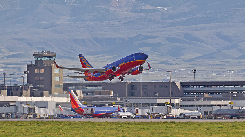
Allegiant
Among airlines, Allegiant Air appeared to be enjoying one of the strongest recoveries. In their May 2020 traffic release, Allegiant noted that over the Memorial Day weekend, Allegiant travellers were about 8% of all passengers passing through a TSA checkpoint, versus 2% last year.
While that statistic cannot be matched without internal booking data, airports that Allegiant dominates can be examined to see how they have changed from 2019 to 2020. From May 1 through July 11 of this year, there were 16 airports where Allegiant had more than 90% of the scheduled seats (for the purposes of this analysis, they will be referred to as ‘Allegiant airports’)
In 2019, those 16 airports saw 0.7% of total throughput at US TSA checkpoints. But in 2020, those airports represented 2.0% of the total, up nearly 170%. If we exclude Tuesdays and Wednesdays, when Allegiant has minimal operations, Allegiant airports represented 2.4% of the total in 2020, up from 0.8% in 2019.
This trend peaked at Memorial Day and while it has declined in July, it is a strong indication that Allegiant picked up substantially more share during the early part of the recovery.

Allegiant airports made up a significantly higher share of total US traffic in 2020 than in 2019.
Furthermore, in regions where Allegiant operates in a multi-airport, metro area, Allegiant airports’ throughput share is significantly and consistently higher in 2020 than it was in 2019, as shown in the table below.
Airports in Florida tended to show the biggest gain in throughput share. The regions showing the smallest increases tend to be those where the Allegiant airport serves a more distinct local market, such as Stockton (SCK), or where there are other factors at play, such as at New York Stewart (SWF), where other airlines suspended service this year.
While this dramatic shift toward Allegiant is likely a temporary feature of the leisure dominated early recovery period, there are broad trends of strength among LCCs and ULCCs and at smaller airports, which CMT will examine next.

LCC Terminals
Even where low-cost carriers (LCCs) operate at the same airports as other carriers, their relative strength can be seen in airports with multiple checkpoints or separate terminals served primarily by LCCs.
In St Louis (STL) and Minneapolis-St Paul (MSP), there are separate terminals that are mostly divided between low-cost carriers and legacy carriers. At STL, TSA throughput at Terminal 2, home to Southwest, is outpacing the year/year traffic at Terminal 1, home to all other airlines, as shown in the graph below.
Similarly, the gap at MSP between Terminal 1-Lindbergh (mostly legacy airlines plus Spirit) and Terminal 2-Humphrey (low cost carriers, especially Sun Country and Southwest) has been growing as throughput at Terminal 2 continues to recover faster.


Similar results can be found at an airport with connected terminals, but with distinct checkpoints. At Phoenix Sky Harbor (PHX), Terminal 4 serves American, Southwest, and some international carriers. While passengers can move between gate areas post-security, checkpoints A and B primarily serve American and the international carriers, while checkpoints C and D primarily serve Southwest.
Again, the checkpoint serving the LCC carrier significantly outperforms the one serving the legacy airline, though that trend is starting to change as all traffic experienced growth in July.
Multi-Airport Regions
Finally, at multi-airport regions without a large Allegiant presence, smaller airports are often outperforming larger airports. Some of this is the relative strength of LCC airlines that often have more service to the smaller airports when compared to the legacy airlines that focus on larger airports. This can be seen in northern California where Oakland (OAK) and San Jose (SJC) outperform San Francisco (SFO).
However, even in regions where small airports do not have stronger LCC presences, these small airports still often do well. Comparing Akron-Canton (CAK) to Cleveland (CLE) in the graph below, CAK is performing much stronger on a per scheduled seat basis, even though CAK had far less LCC service than CLE over this time period.
This data, using published schedules via Airline Data Inc, shows that on a local basis, CAK is processing 0.8-0.9 passengers through TSA for each seat, while CLE is only getting 0.6-0.7 passengers per seat.
While this is not directly comparable to a traditional load factor metric. it does provide an indicator of how many local passengers are filling up flights, and the relative strength at CAK vs. CLE.

Smaller airports, such as Akron-Canton (CAK) are filling their seats more than larger airports, like Cleveland (CLE).
Smaller airports, such as Akron-Canton (CAK) are filling their seats more than larger airports, like Cleveland (CLE).
Conclusion
Using data from the TSA, CMT has a very good sense of how individual airports are performing relative to peers and competitors, and a clear picture of how the recovery varies by geography, airport size, and airline type. It is apparent, through our analysis, that low-cost, nonstop leisure demand is outpacing other market segments.
• Harrison Earl is a senior consultant and Nicholas Haan is the director of CMT’s air service development team. Both have extensive previous experience in the airline industry. Earl can be reached at hearl@cmtengr.com. Haan can be reached at nhaan@cmtengr.com.


